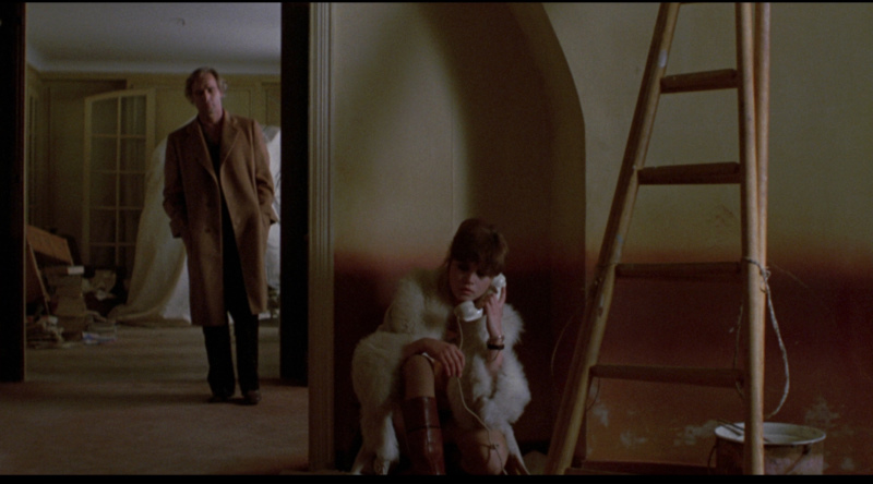
Though most famous for all the sex and butter, what I was most drawn to with this film was the production design. Usually design has to be really ostentatious to get the average viewer’s attention. It has to be some sort of story-book, alternate world like in a Wes Anderson film or set in an alien/future world like Blade Runner. But when you really get down to it, all films are designed. Someone has to pick this location rather than that location because this location helps to better tell the story.
With its brown tones and dirty walls, this film epitomizes what we who did not live through the 70’s imagine that they looked like. But this film is not reality. Director Bernardo Bertolucci, cinematographer Vittorio Storaro and production designer Philippe Turlure consciously got together and picked a color pallet and a location that would give them what they needed. That cloth draped mass in the back room was not there by accident and the same goes for the stained walls that are reminiscent of a painting by Mark Rothko. And oh that pebbled glass! It’s a shorthand that creates a mood which instantly sucks you into this film’s world of lust, rage and anguish. You could turn off the sound and still “get” what is being conveyed. This is pure cinema.


No comments:
Post a Comment